
Using Tkinter and Matplotlib
January 1, 2019
Recently I was working on a project in which I needed to quickly visualize groups of 2D data points.
As the project was in Python, I thought the well-established libraries Tkinter and matplotlib
would be useful for this task. Unfortunately, I had to hunt through many sources to figure out
how to use these two libraries together, so I am writing this blog post to help others who may have
similar needs.
Below is the result from our project:
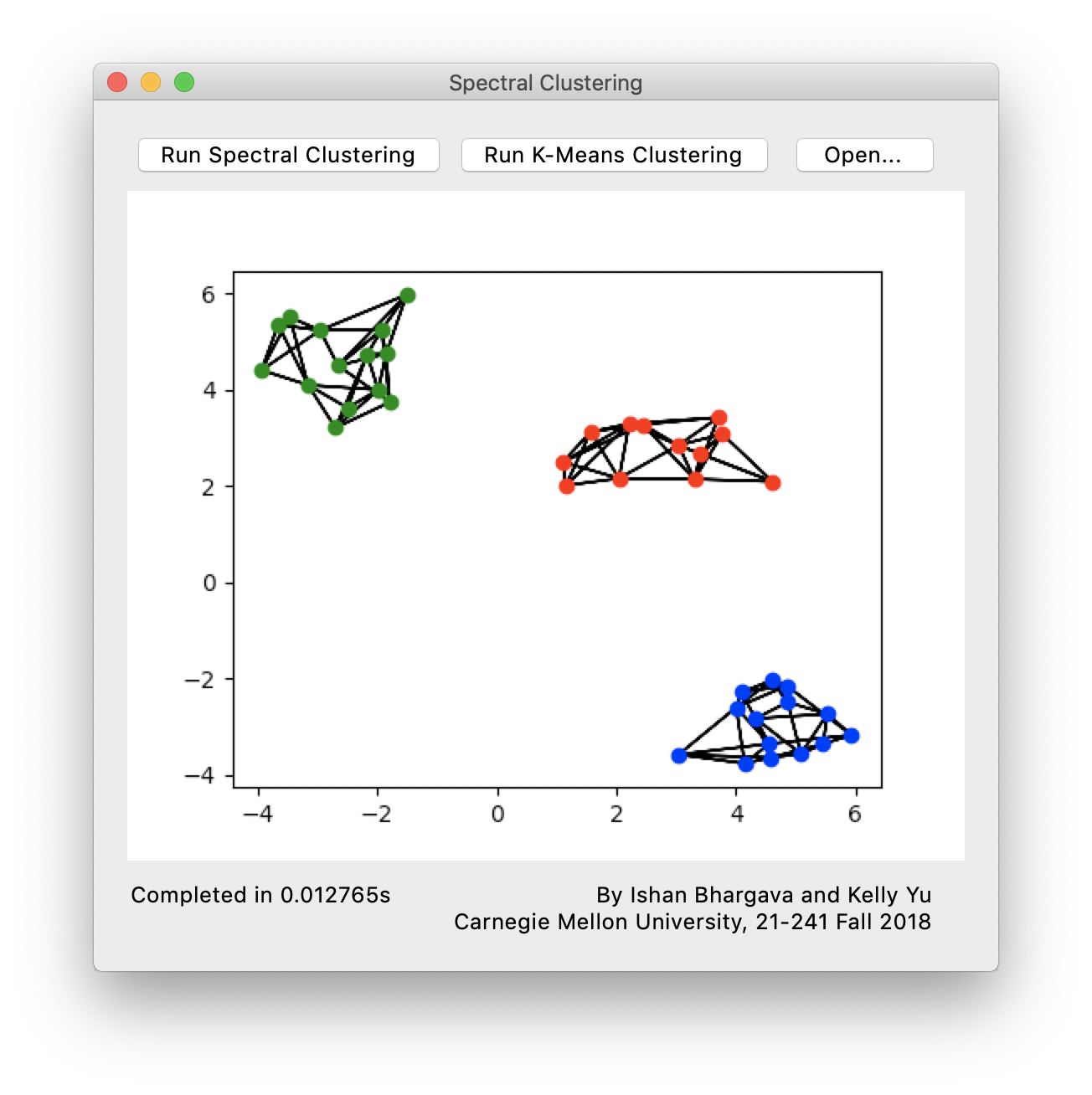
As you can see we have displayed three groups of data points, each in a different color.
First we will look at setting up the matplotlib environment in Tkinter. Here is a minimal
set of necessary import statements.
from tkinter import *
from tkinter.ttk import *

import matplotlib
matplotlib.use("TkAgg")

from matplotlib.figure import Figure
from matplotlib.backends.backend_tkagg import FigureCanvasTkAgg
For the purposes of this blog post we will create a window with nothing but the matplotlib canvas
to make things simpler. Suppose our Tkinter application consists of nothing but the following:
root = Tk()
Now we can start creating the matplotlib canvas.
figure = Figure(figsize=(5, 4), dpi=100)
plot = figure.add_subplot(1, 1, 1)
There are some options which can be configured here, such as figsize which takes a width by height in inches, and the dpi.
We can specify the position of the subplot, here we use (1, 1, 1) as the top-left corner, which will cause the subplot to
take up the entire figure.
This doesn’t draw anything to screen yet, in order to do that we need to create an instance of FigureCanvasTkAgg. To the
best of my knowledge we will need to do this every time we finish updating the canvas.
canvas = FigureCanvasTkAgg(figure, root)
canvas.get_tk_widget().grid(row=0, column=0)
Then of course to begin the application
root.mainloop()
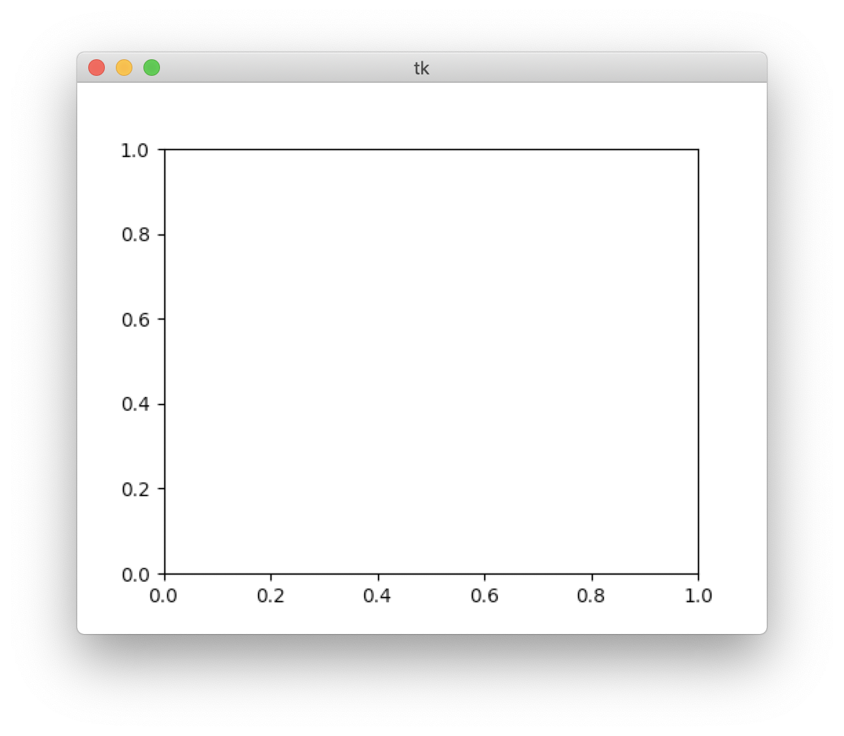
The code up to this point will draw a blank graph, like this:
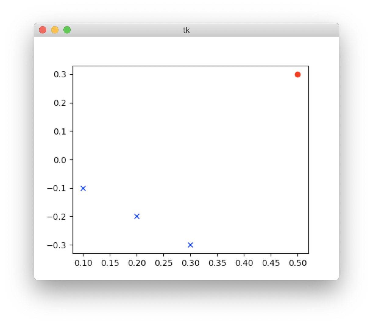
Now we can start plotting points on our graph. To do so, we use the plot method on the subplot we created earlier
plot.plot(0.5, 0.3, color="#C41E3A", marker="o", linestyle="")
This will plot a single point at coordinates (0.5, 0.3). We can also plot multiple points at once by passing separate
lists of x and y values.
x = [ 0.1, 0.2, 0.3 ]
y = [ -0.1, -0.2, -0.3 ]
plot.plot(x, y, color="blue", marker="x", linestyle="")
This will plot the points (0.1, -0.1), (0.2, -0.2), and (0.3, -0.3).
For colors, matplotlib features a few built in colors which can be seen here, or you can specify then as a hex triplet.
There are many different marker styles to choose from, here is a full list.
Finally, by default, matplotlib will connect all points we plot, but we can turn this off by passing an empty linestyle.
Here we drew our points all at once, but if we had drawn them dynamically (e.g. as a result of pressing a button)
we would have needed to create the FigureCanvasTkAgg object again and regrid it, as demonstrated above.
So the final code for our graph application:
from tkinter import *
from tkinter.ttk import *

import matplotlib
matplotlib.use("TkAgg")
from matplotlib.figure import Figure
from matplotlib.backends.backend_tkagg import FigureCanvasTkAgg

root = Tk()

figure = Figure(figsize=(5, 4), dpi=100)
plot = figure.add_subplot(1, 1, 1)

plot.plot(0.5, 0.3, color="red", marker="o", linestyle="")

x = [ 0.1, 0.2, 0.3 ]
y = [ -0.1, -0.2, -0.3 ]
plot.plot(x, y, color="blue", marker="x", linestyle="")

canvas = FigureCanvasTkAgg(figure, root)
canvas.get_tk_widget().grid(row=0, column=0)

root.mainloop()
So that is a quick, simple, and customizable way of visualizing data.